01
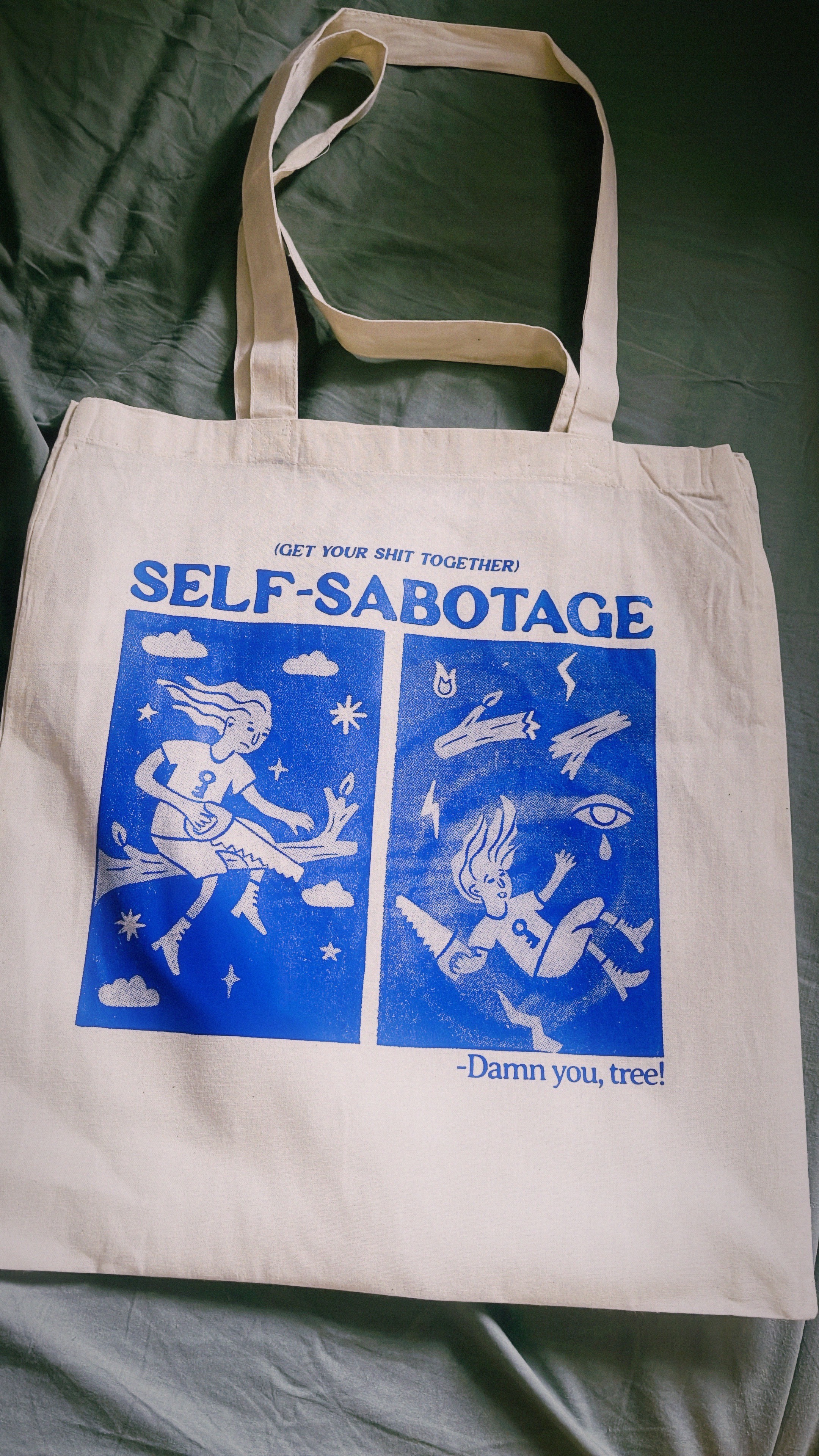
SELF-SABOTAGE
SELF-SABOTAGE
SELF-SABOTAGE
Welcome to the project template page, where web design innovation converges with aesthetics. Embark on a visual journey that transcends the ordinary as we delve into the realm of website design. In this curated space, we craft compelling narratives through the artful fusion of color, typography, and graphic elements.
ILLUSTRATION
APPAREL
YEAR
2025
MIMIBLUE
SELF-SABOTAGE
THE BRIEF
CLIENT BACKGROUND:
The client is a design strategist with 4 years of experience in consulting, primarily in the finance and education sectors. She was looking for a logo, brand guidelines, business cards, and branded Google Slides templates to use for future case studies and interviews.
CLIENT BACKGROUND:
The client is a design strategist with 4 years of experience in consulting, primarily in the finance and education sectors. She was looking for a logo, brand guidelines, business cards, and branded Google Slides templates to use for future case studies and interviews.
DESIGN GOALS:
She wanted a brand identity that visually represented their philosophy towards their work, which included curiosity, compassion, and precision. The aesthetic preferences of the client included color and texture, with a balance between colorful, textured assets and clean lines. She specifically liked red, pink, and yellow hues and assets that were more rounded or organic.
DESIGN GOALS:
She wanted a brand identity that visually represented their philosophy towards their work, which included curiosity, compassion, and precision. The aesthetic preferences of the client included color and texture, with a balance between colorful, textured assets and clean lines. She specifically liked red, pink, and yellow hues and assets that were more rounded or organic.

THE CONCEPT
At the heart of this project lies the philosophy that less is more. The design revolves around a clean and unembellished aesthetic, utilizing a restrained color palette, generous white space, and simple typography. The concept is to create a serene digital environment that allows users to navigate effortlessly while focusing on the essential content.
At the heart of this project lies the philosophy that less is more. The design revolves around a clean and unembellished aesthetic, utilizing a restrained color palette, generous white space, and simple typography. The concept is to create a serene digital environment that allows users to navigate effortlessly while focusing on the essential content.

A NICE STATEMENT ABOUT THE PROJECT
A few lines of copy here to really hit the message home.

Carefully selected fonts contribute to the project's minimalistic charm. The typography is chosen not just for its visual appeal but also for its readability. Each font complements the overall design, enhancing the user's experience by making content easily digestible.
Carefully selected fonts contribute to the project's minimalistic charm. The typography is chosen not just for its visual appeal but also for its readability. Each font complements the overall design, enhancing the user's experience by making content easily digestible.

THE RESULTS
STATISITIC
STATISITIC
2500
2500
2500
STATISITIC
STATISITIC
35%
35%
35%
STATISITIC
STATISITIC
400
400
400
STATISITIC
STATISITIC
2500
2500
2500
STATISITIC
STATISITIC
25
25
25

THE OUTCOME
In conclusion, this minimalist design project is a celebration of the elegance found in simplicity. It is a canvas where content takes center stage, supported by a design that is not just visually appealing but purposeful in guiding users through a seamless and enjoyable digital journey.
In conclusion, this minimalist design project is a celebration of the elegance found in simplicity. It is a canvas where content takes center stage, supported by a design that is not just visually appealing but purposeful in guiding users through a seamless and enjoyable digital journey.
© JACKELDER.DESIGN
© 2024